19 May 2023
|
Time to read:
2 mins
|
My work
Designing a detailed checkbox component
I recently designed a new, detailed checkbox component for our design system. I was working on a new feature that would introduce some new user roles, increasing the number of roles from two to four. Accommodating these new roles and maintaining and easy-to-understand interface was going to be challenging with our existing checkboxes, so I took the opportunity to build something
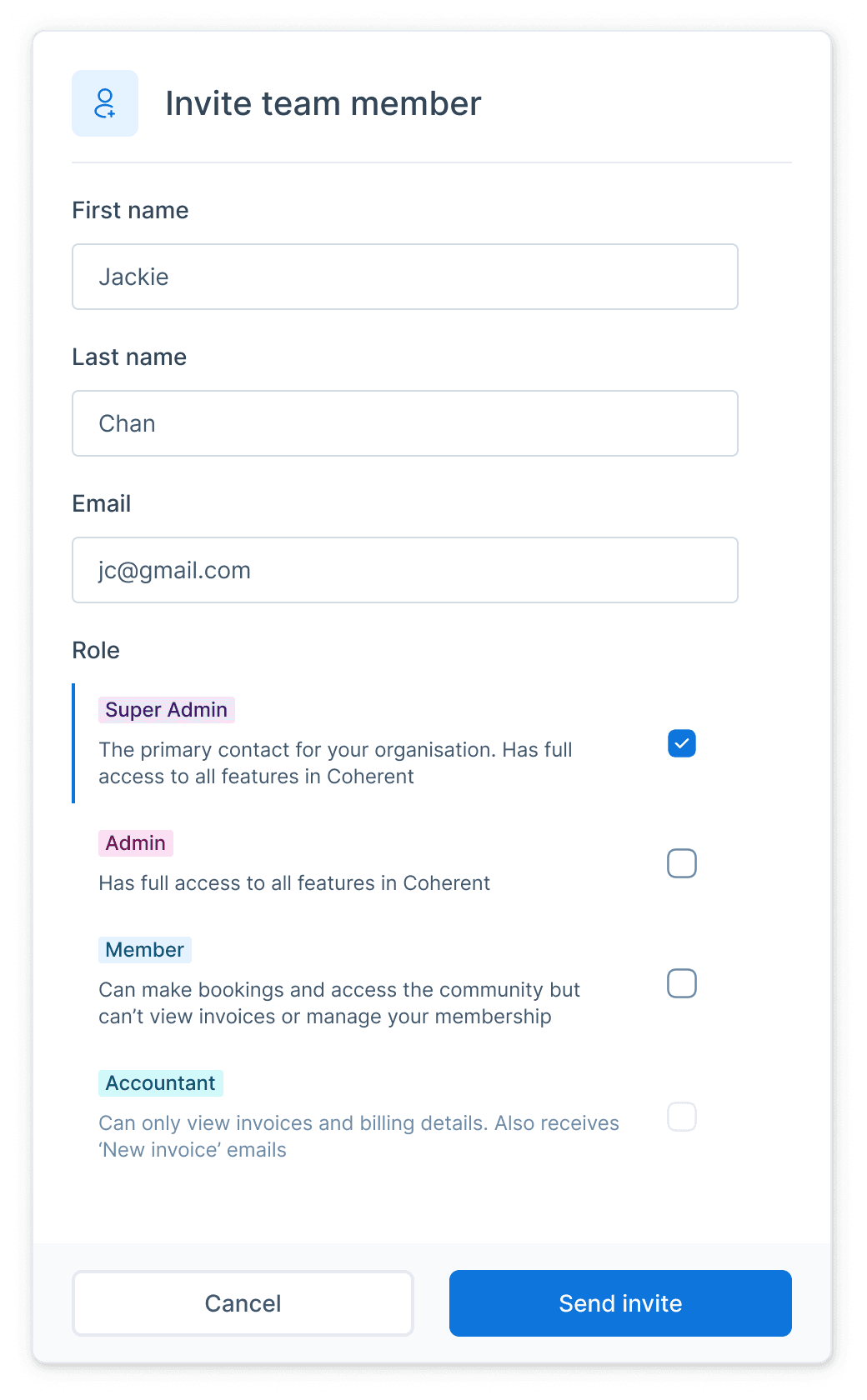
When a user is inviting a new user to join their team, they would see a field prompting them to select the new users role. The checkbox content was the name of the role, and then the role descriptions were included as a field hint.
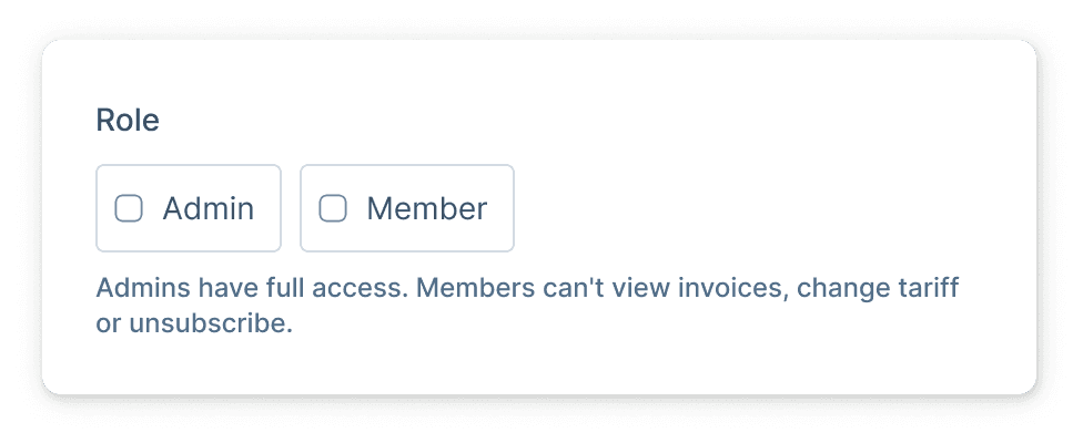
As we were introducing two new roles, the differences between the now four roles became more subtle making the role descriptions more important. Relying on a field hint to describe four wasn’t really an option any more - the hint would span several lines and a short paragraph of text would be visibly overwhelming and difficult to scan
The aim therefore was to design a new type of checkbox that would allow us to display the role description, alongside the role itself as a way of a) avoiding a paragraph of text explaining roles, and b) providing context-in-situ to reduce the risk of a user selecting the wrong role having missed or misread the role description
I explored a couple of options but fairly quickly settled on what I’ve now christened, a "detailed checkbox".
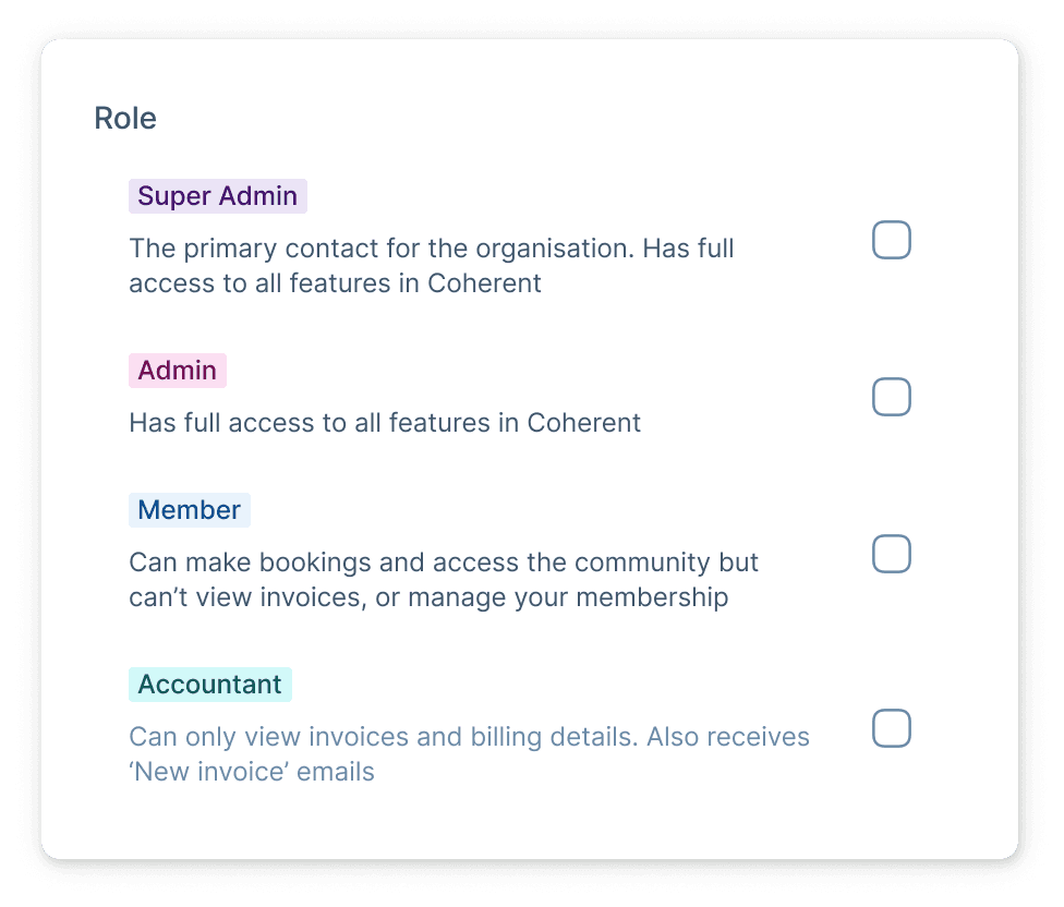
Roles are always displayed as coloured labels to allow the user to more quickly scan the page content, so in the interest of consistency, I used the same labels and followed them up with the role description
I added a checkbox icon and a left-border colour change to indicate the `checked` state, and to ensure this component would be reusable outside of user roles, added disabled states, and created a variant that uses a text title instead of a label.
Thanks for reading!
Alex :)
I recently designed a new, detailed checkbox component for our design system. I was working on a new feature that would introduce some new user roles, increasing the number of roles from two to four. Accommodating these new roles and maintaining and easy-to-understand interface was going to be challenging with our existing checkboxes, so I took the opportunity to build something
When a user is inviting a new user to join their team, they would see a field prompting them to select the new users role. The checkbox content was the name of the role, and then the role descriptions were included as a field hint.
As we were introducing two new roles, the differences between the now four roles became more subtle making the role descriptions more important. Relying on a field hint to describe four wasn’t really an option any more - the hint would span several lines and a short paragraph of text would be visibly overwhelming and difficult to scan
The aim therefore was to design a new type of checkbox that would allow us to display the role description, alongside the role itself as a way of a) avoiding a paragraph of text explaining roles, and b) providing context-in-situ to reduce the risk of a user selecting the wrong role having missed or misread the role description
I explored a couple of options but fairly quickly settled on what I’ve now christened, a "detailed checkbox".
Roles are always displayed as coloured labels to allow the user to more quickly scan the page content, so in the interest of consistency, I used the same labels and followed them up with the role description
I added a checkbox icon and a left-border colour change to indicate the `checked` state, and to ensure this component would be reusable outside of user roles, added disabled states, and created a variant that uses a text title instead of a label.
Thanks for reading!
Alex :)
More like this.
8 May 2024
|
Time to read:
|
My work
We redesigned some components, introduced design tokens and officially launched Hotdesk - the design system behind Coherent
28 Mar 2024
|
Time to read:
1 Min
|
My work
How adding a tiny piece of UI to my labels helped to make them stand out
19 Jan 2023
|
Time to read:
2 mins
|
My work