19 Jan 2023
|
Time to read:
2 mins
|
My work
Making labels POP with indicators
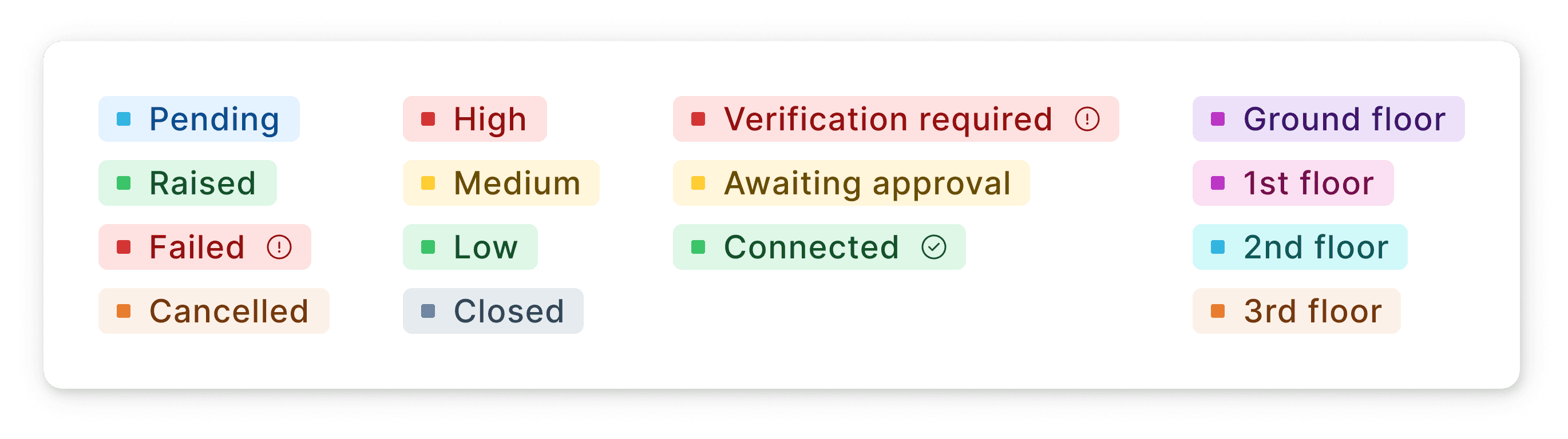
I was recently designing some labels for our component library that we could use for things like invoice status, integration category and tags on user profiles.
They’re simple labels containing text and occasionally an icon, and would exist in several colours to accommodate as wide a range of use cases as possible
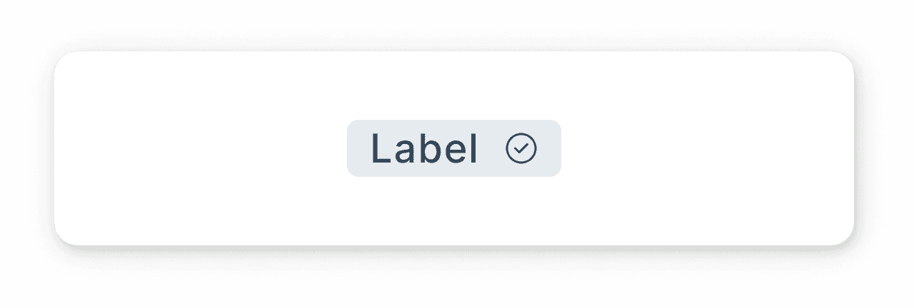
Once I’d settled on the general layout of the labels, I started playing around with colours; trying different combinations of background, border, text and icon colours.
I’d just finished overhauling our colour palette so had plenty of colours to play with; each one with a scale from 900 to 100
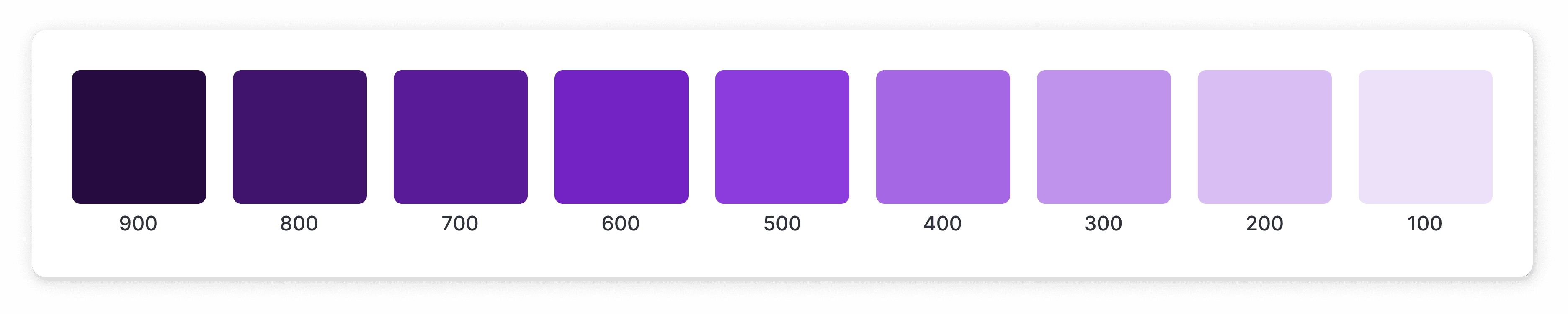
As I’d recently reworked these colours, I already knew how to ensure that the contrast ratio between the darker text and lighter background colour met the minimum 4.5:1 requirement, so I set them up to use 100 for the background and 800 for the text.
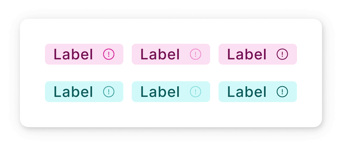
I tested using a lighter colour for the icon but found that they were often difficult to make out as they were so small and mostly using an outline style. I felt that the label also felt a bit disconnected when the text and icon were different colours too
Once I’d finished this stage, I began introducing them into my current design projects as a way of "testing them in production" before we went ahead and built them
I quickly found that there were some locations and some colour combinations that felt a little flat or a little muted - they didn’t stand out quite as well as I wanted them to
Knowing that I didn’t have too much room to play with the contrast ratio, and without wanting to update our colour palette again just to accommodate this issue, I looked for other options
Shadows and borders made the labels feel overcomplicated, and whilst some labels looked good with filled icons, some didn’t, so I didn’t want to rely on this either
In the end I added what I’ve called an 'Indicator'. It’s a 6 x 6px square with a 1px corner radius and 8px padding all around. It uses a 500 colour, compared to the 100 background and 800 text and icon. And I think it looks pretty good if I do say so myself
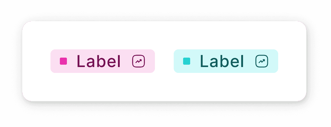
Maybe there’s something scientific happening here, or maybe it’s just a placebo, but I feel like the lightness of the indicator tricks my eyes into thinking that the label text is lighter than it is, which in turn makes the whole label 'pop' a bit more than it did before
If you found this useful, or have any feedback or suggestions, feel free to message me on twitter! And if you want to show this some love on dribbble, it'd be much appreciated
Thanks for reading!
Alex :)
I was recently designing some labels for our component library that we could use for things like invoice status, integration category and tags on user profiles.
They’re simple labels containing text and occasionally an icon, and would exist in several colours to accommodate as wide a range of use cases as possible
Once I’d settled on the general layout of the labels, I started playing around with colours; trying different combinations of background, border, text and icon colours.
I’d just finished overhauling our colour palette so had plenty of colours to play with; each one with a scale from 900 to 100
As I’d recently reworked these colours, I already knew how to ensure that the contrast ratio between the darker text and lighter background colour met the minimum 4.5:1 requirement, so I set them up to use 100 for the background and 800 for the text.
I tested using a lighter colour for the icon but found that they were often difficult to make out as they were so small and mostly using an outline style. I felt that the label also felt a bit disconnected when the text and icon were different colours too
Once I’d finished this stage, I began introducing them into my current design projects as a way of "testing them in production" before we went ahead and built them
I quickly found that there were some locations and some colour combinations that felt a little flat or a little muted - they didn’t stand out quite as well as I wanted them to
Knowing that I didn’t have too much room to play with the contrast ratio, and without wanting to update our colour palette again just to accommodate this issue, I looked for other options
Shadows and borders made the labels feel overcomplicated, and whilst some labels looked good with filled icons, some didn’t, so I didn’t want to rely on this either
In the end I added what I’ve called an 'Indicator'. It’s a 6 x 6px square with a 1px corner radius and 8px padding all around. It uses a 500 colour, compared to the 100 background and 800 text and icon. And I think it looks pretty good if I do say so myself
Maybe there’s something scientific happening here, or maybe it’s just a placebo, but I feel like the lightness of the indicator tricks my eyes into thinking that the label text is lighter than it is, which in turn makes the whole label 'pop' a bit more than it did before
If you found this useful, or have any feedback or suggestions, feel free to message me on twitter! And if you want to show this some love on dribbble, it'd be much appreciated
Thanks for reading!
Alex :)
More like this.
8 May 2024
|
Time to read:
|
My work
We redesigned some components, introduced design tokens and officially launched Hotdesk - the design system behind Coherent
28 Mar 2024
|
Time to read:
1 Min
|
My work
My process for designing a new type of checkbox, displaying more information and providing more context for users
19 May 2023
|
Time to read:
2 mins
|
My work